wf.iplot_line(y, x=’TIME’, marginal_x=None, marginal_y=’histogram’, color=’auto’, range_y=’auto’, line_shape=’lineard’, rangeslider_visible=True, line_group=’DEPTH’, **kwds)
It uses plotly.express.line.
Each data point is represented as a marker point, whose location is given by the x and y columns of self.data.
Reference
Parameters
- y: Y axis, column or index of data. (str)
- x: X axis, column or index of data. (str)
- color: Name of a column or index of data. Values from this column are used to assign color to marks. (str)
- If color = ‘auto’, color = QC column of y.
- symbol: Name of a column or index of data. Values from this column are used to assign symbols to marks. (str)
- range_y: [min value, max value] of y axes. (list)
- If range_y = ‘auto’, range is generated between the min and max values of y axes +- 5%.
- line_shape: Line options: ‘linear’ ‘spline’, ‘vhv’, ‘hvh’, ‘vh’, ‘hv’ (str)
- rangeslider_visible: Show a time range slide on the bottom x axes. (bool)
- line_group: Either a name of a column in wf.data, or a pandas Series or array_like object. Values from this column or array_like are used to group rows of data_frame into lines. (str or int or Series or array-like)
- **kwds: Plotly express scatter keywords. (keywords)
Returns
- fig: (plotly.graph_objects.Figure)
Example
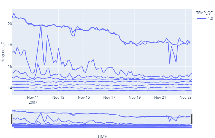
For this example we are going to download water temperature data from EMSO platform 68422. We will download 1000 values without specifying the time range or depth.
import mooda as md

wf = md.from_emso(platform_code='68422', parameters=['TEMP'], size=1000)

fig = wf.iplot_line('TEMP')
fig.show()
Output:
Note - The output graph is interactive. Below is the figure saved in a png image.

Return to mooda.WaterFrame.